|
|
Using the JFC/Swing Packages |
AJScrollPaneprovides a scrollable view of a lightweight component. When screen real estate is limited, use a scroll pane to display a component that is large or one whose size can change dynamically.
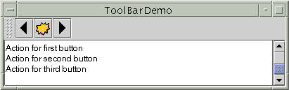
The code to create a scroll pane can be minimal. For example, here's a picture of a demo program that uses a scroll pane to view textual output:
And here's the code that creates the text area, makes it the scroll pane's client, and adds the scroll pane to the window:The program provides the text area as an argument totextArea = new JTextArea(5, 30); JScrollPane scrollPane = new JScrollPane(textArea); ... contentPane.setPreferredSize(new Dimension(400, 100)); ... contentPane.add(scrollPane, BorderLayout.CENTER);JScrollPane's constructor. This establishes the text area as the scroll pane's client. The scroll pane handles everything else: creating the scroll bars when necessary, redrawing the client when the user moves the scroll knobs, and so on.Note that the code sample sets the preferred size of the scroll pane's container. An alternative would be to set the preferred size of the scroll pane. Either way, you're limiting the size of the scroll pane. This is necessary because the default preferred size of the scroll pane is likely to be too big.
By default, a scroll pane attempts to size itself so that its client displays at its preferred size. Many components have a simple preferred size that's big enough to display the entire component. This makes the scroll pane redundant. Other components, like lists, tables, text components, and trees, report a separate preferred size for scrolling that's usually smaller than the standard preferred size. For example, by default, a list's preferred size for scrolling is just big enough to display eight rows. If the preferred size reported by the component you're using is not what you want, set the preferred size of the scroll pane or its container.
If all you need to do is providing basic scrolling for a lightweight component, read no further. As this demo program illustrates, a generic scroll pane is sufficient for many programs.
However, a scroll pane is a highly customizable object. You can determine the circumstances under which scroll bars are displayed. You can also decorate the scroll pane with a row header, column header, and corners. Finally, you can implement a scrolling-savvy client that advises the scroll pane about scrolling behavior such as unit and block increments. These topics are discussed in the following sections:
- How a Scroll Pane Works
- Setting the Scroll Bar Policy
- Providing Custom Decorations
- Implementing a Scrolling-Savvy Client
- The Scroll Pane API
- Examples that Use JScrollPane
How a Scroll Pane Works
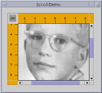
Here is a snapshot of an application that uses a fully-loaded scroll pane to view a picture of Mary's dad as a youth:The scroll pane in this application looks remarkably different from the one in the previous demo program. Rather than text, this scroll pane contains a large image. The scroll pane also has two scroll bars, a row header, a column header, and three custom corners, one of which contains a toggle button.This program establishes the scroll pane's client when creating the scroll pane:
Try this:
- Compile and run the application. The main source file is
ScrollDemo.java. You also needScrollablePicture.java,Rule.java,Corner.javaandyoungdad.jpeg.
See Getting Started with Swing if you need help.- Move the knobs on the scroll bars. Watch the image scroll and the horizontal and vertical rulers scroll along.
- Click the cm toggle in the upper left corner. The units on the row and column headers change to inches (or back to centimeters).
- Click the arrow buttons on the scroll bars. Also, try clicking on the track above or below the knob on the vertical scroll bar, or to the left or right of the horizontal one.
- Reduce the size of the window. Notice that the scroll bars disappear when not needed and as a result the attached corners disappear as well. Stretch the window and the scroll bars and corners reappear.
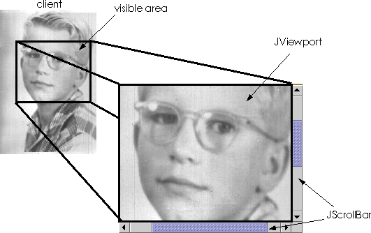
You can change a scroll pane's client dynamically by calling the// where the member variables are declared private ScrollablePicture picture; ... // where the GUI is created picture = new ScrollablePicture( ... ); JScrollPane pictureScrollPane = new JScrollPane(picture);setViewportViewmethod.When you manipulate the scroll bars in a scroll pane, you change the area of the client that is visible. This picture shows this relationship and indicates the classes that the scroll pane commissions to help:
When you move the knob on the vertical scroll bar up and down, the visible area of the client moves up and down. Similarly, when you move the knob on the horizontal scroll bar to the right and left, the visible area of the client moves back and forth accordingly.
A scroll pane uses a
JViewportJScrollBarTypical programs don't directly instantiate or call methods on a viewport or scroll bar. Instead, programs achieve their scrolling behavior using the
JScrollPaneAPI and the API discussed in Implementing a Scrolling-Savvy Client. Some scrolling-savvy components such asJTableandJTreealso provide some API to help you affect their scrolling behavior.Setting the Scroll Bar Policy
On startup, theScrollDemoapplication contains two scroll bars. If you make the window as large as your screen, both scroll bars disappear because they no longer needed. This behavior is controlled by the scroll pane's scroll bar policy. Actually, it's two policies: you specify the policy for each scroll bar separately.Of the constructors provided by
JScrollPane, two let you set the scroll bar policies when you create the scroll pane:The firstJScrollPane(Component, int, int) JScrollPane(int, int)intspecifies the policy for the vertical scroll bar, the second specifies the policy for the horizontal scroll bar. You can also set the policies dynamically with thesetHorizontalScrollBarPolicyandsetVerticalScrollBarPolicymethods. With both the constructors and the methods, use one of the followingints defined in theScrollPaneConstantsJScrollPane:
Policy Description VERTICAL_SCROLLBAR_AS_NEEDED
HORIZONTAL_SCROLLBAR_AS_NEEDEDThe default. The scroll bar appears when the viewport is smaller than the client and disappears when the viewport is larger than the client. VERTICAL_SCROLLBAR_ALWAYS
HORIZONTAL_SCROLLBAR_ALWAYSAlways display the scroll bar. The knob disappears if the viewport is large enough to show the whole client. VERTICAL_SCROLLBAR_NEVER
HORIZONTAL_SCROLLBAR_NEVERNever display the scroll bar. Use this option if you don't want the user to directly control what part of the client is shown. Perhaps you have an application which requires all scrolling to occur programmatically. Providing Custom Decorations
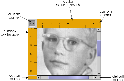
At most, the area drawn by a scrollpane is divided into nine parts: the center, four sides, and four corners. The center is the only component that is always present in all scroll panes. Each of the four sides is optional. The top side can contain a column header, the left side can contain a row header, the bottom side can contain a horizontal scroll bar, and the right side can contain a vertical scroll bar. The presence of each corner depends entirely on the presence of the two sides that intersect there.As shown in the figure, the scroll pane inScrollDemo.javahas custom row and column headers. Additionally, because all four sides are populated, all four corners are present. Three of the corners are customized.The scroll pane's row and column headers are provided by a custom
JComponentsubclass,Rule.java, that draws a ruler in centimeters or inches. Here's the code that creates and sets the scroll pane's row and column headers:You can use any lightweight component for a scroll pane's row and column headers. The scroll pane puts the row and column headers in...where the member variables are defined... private Rule columnView; private Rule rowView; ... // Create the row and column headers columnView = new Rule(Rule.HORIZONTAL, false); columnView.setPreferredWidth(david.getIconWidth()); rowView = new Rule(Rule.VERTICAL, false); rowView.setPreferredHeight(david.getIconHeight()); ... pictureScrollPane.setColumnHeaderView(columnView); pictureScrollPane.setRowHeaderView(rowView); ...JViewPorts of their own. Thus, when scrolling horizontally, the column header follows along, and when scrolling vertically, the row header follows along.As a
JComponentsubclass,Rulerenders itself by overriding thepaintComponentmethod. Careful scrutiny of the code reveals that special effort is taken to draw only within the current clipping bounds. Your custom row and column headers should do the same to ensure speedy scrolling.You can also use any lightweight component for the corners of a scroll pane.
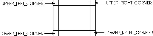
ScrollDemo.javaillustrates this by putting a toggle button in the upper left corner, and customCornerobjects in the upper right and lower left corners. Here's the code that creates the corner objects and callssetCornerto place them:Remember that the size of each corner is completely determined by the size of the sides intersecting there. You must take care that the object in the corner fits in its corner. The// Create the corners JPanel buttonCorner = new JPanel(); isMetric = new JToggleButton("cm", true); isMetric.setFont(new Font("SansSerif", Font.PLAIN, 11)); isMetric.setMargin(new Insets(2,2,2,2)); isMetric.addItemListener(new UnitsListener()); buttonCorner.add(isMetric); //Use the default FlowLayout ...// Set the corners: pictureScrollPane.setCorner(JScrollPane.UPPER_LEFT_CORNER, buttonCorner); pictureScrollPane.setCorner(JScrollPane.LOWER_LEFT_CORNER, new Corner()); pictureScrollPane.setCorner(JScrollPane.UPPER_RIGHT_CORNER, new Corner());Cornerclass does this by drawing within its bounds, which are set by the scroll pane. The toggle button was set up specifically to fit within the corner established by the headers.As you can see from the code, constants indicate the corner positions. This figures shows the constant for each position:
The constants are defined in the
ScrollPaneConstantsinterface, whichJScrollPaneimplements.Implementing a Scrolling-Savvy Client
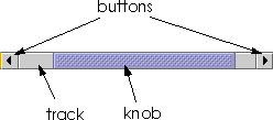
To customize the way that a client component interacts with its scroll pane, you can make the component implement theScrollableScrollable, a client can specify both the size of the viewport the scroll pane uses to view it and the amount to scroll for clicks on the different controls on a scrollbar.The following figure shows the three areas of a scroll bar: the knob, the buttons, and the track.
You might have noticed when manipulating the scroll bars inScrollDemothat clicking the buttons scrolls the image to a tick boundary. You might also have noticed that clicking in the track scrolls the picture by a "screenful". More generally, the button scrolls the visible area by a unit increment and the track scrolls the visible area by a block increment. The behavior you see in the example is not the scroll pane's default behavior, but is specified by the client in its implementation of theScrollableinterface.The client for the
ScrollDemoprogram isScrollablePicture.java.ScrollablePictureis a subclass ofJLabelthat provides implementations of all fiveScrollablemethods:
getScrollableBlockIncrementgetScrollableUnitIncrementgetPreferredViewportSizegetScrollableTracksViewportHeightgetScrollableTracksViewportWidthScrollablePictureimplements theScrollableinterface primarily to affect the unit and block increments. However, it must provide implementations for all five methods. The implementations for the last three are reasonable defaults.The scroll pane calls the client's
getScrollableUnitIncrementmethod whenever the user clicks one of the buttons on the scroll bar. This method returns the number of pixels to scroll. An obvious implementation of this method returns the number of pixels between tick marks on the header rulers. ButScrollablePicturedoes something different: It returns the value required to position the image on a tick mark boundary. Here's the implementation:If the image is already on a tick mark boundary, this method returns the number of pixels between ticks. Otherwise, it returns the number of pixels from the current location to the nearest tick.public int getScrollableUnitIncrement(Rectangle visibleRect, int orientation, int direction) { //get the current position int currentPosition = 0; if (orientation == SwingConstants.HORIZONTAL) currentPosition = visibleRect.x; else currentPosition = visibleRect.y; //return the number of pixels between currentPosition //and the nearest tick mark in the indicated direction if (direction < 0) { int newPosition = currentPosition - (currentPosition / maxUnitIncrement) * maxUnitIncrement; return (newPosition == 0) ? maxUnitIncrement : newPosition; } else { return ((currentPosition / maxUnitIncrement) + 1) * maxUnitIncrement - currentPosition; } }Likewise, the scroll pane calls the client's
getScrollableBlockIncrementmethod each time the user clicks on the track. Here'sScrollablePicture's implementation of this method:This method returns the height of the visible rectangle minus a tick mark. This behavior is typical. A block increment should be slightly smaller than the viewport to leave a little of the previous visible area for context. For example, a text area might leave one or two lines of text for context and a table might leave a row or column (depending on the scroll direction).public int getScrollableBlockIncrement(Rectangle visibleRect, int orientation, int direction) { if (orientation == SwingConstants.HORIZONTAL) return visibleRect.width - maxUnitIncrement; else return visibleRect.height - maxUnitIncrement; }See the Implementing the Scrollable Interface API table for further details about the methods defined in
Scrollable.The Swing packages provide these scrolling-savvy classes:
The Scroll Pane API
The following tables list the commonly usedJScrollPaneconstructors and methods. Other methods you're likely to call are defined by theJComponentComponentThe API for using scroll panes falls into these categories:
Setting Up the Scroll Pane Method Purpose JScrollPane()
JScrollPane(Component)
JScrollPane(int, int)
JScrollPane(Component, int, int)Create a scroll pane. The Componentparameter, when present, sets the scroll pane's client. The twointparameters, when present, set the vertical and horizontal scroll bar policies (respectively).void setViewportView(Component)Set the scroll pane's client. void setVerticalScrollBarPolicy(int)
int getVerticalScrollBarPolicy()Set or get the vertical scroll policy. ScrollPaneConstantsdefines three values for specifying this policy:VERTICAL_SCROLL_BAR_AS_NEEDED(the default),VERTICAL_SCROLL_BAR_ALWAYS, andVERTICAL_SCROLL_BAR_NEVER.void setHorizontalScrollBarPolicy(int)
int getHorizontalScrollBarPolicy()Set or get the horizontal scroll policy. ScrollPaneConstantsdefines three values for specifying this policy:HORIZONTAL_SCROLL_BAR_AS_NEEDED(the default),HORIZONTAL_SCROLL_BAR_ALWAYS, andHORIZONTAL_SCROLL_BAR_NEVER.void setViewportBorder(Border)
Border getViewportBorder()Set or get border around the viewport.
Decorating the Scroll Pane Method Purpose void setColumnHeaderView(Component)
void setRowHeaderView(Component)Set the column or row header for the scroll pane. void setCorner(Component, int)
Component getCorner(int)Set or get the corner specified. The intparameter specifies which corner and must be one of the following constants defined inScrollPaneConstants:UPPER_LEFT_CORNER,UPPER_RIGHT_CORNER,LOWER_LEFT_CORNER, andLOWER_RIGHT_CORNER.
Implementing the Scrollable Interface Method Purpose int getScrollableUnitIncrement(Rectangle, int, int)
void getScrollableBlockIncrement(Rectangle, int, int)Get the unit or block increment in pixels. The Rectangleparameter is the bounds of the currently visible rectangle. The firstintparameter is eitherSwingConstants.HORIZONTALorSwingConstants.VERTICALdepending on what scroll bar the user clicked on. The secondintparameter indicates which direction to scroll. A value less than 0 indicates up or left. A value greater than 0 indicates down or right.Dimension getPreferredScrollableViewportSize()Get the preferred size of the viewport. This allows the client to influence the size of the viewport in which it will be displayed. If the viewport size is unimportant, return getPreferredSize.boolean getScrollableTracksViewportWidth()
boolean getScrollableTracksViewportHeight()Get whether the scroll pane should force the client to be the same width or hieght as the viewport. Returns truefrom either of these methods effectively disallows horizontal or vertical scrolling (respectively).Examples that Use JScrollPane
This table shows the examples that useJScrollPaneand where those examples are described.
Example Where Described Notes ToolBarDemo.javaThis page and
How to Use Tool Bars.Shows a simple, yet typical, use of a scroll pane. ScrollDemo.javaThis page. Uses many of scroll pane's bells and whistles. SplitPaneDemo.javaHow to Use Split Panes and How to Use Lists. Puts a list in a scroll pane. Also, shows how to handle the case when a scrollable client changes size. TableDemo.javaHow to Use Tables. Puts a table in a scroll pane. TreeDemo.javaHow to Use Trees. Puts a tree in a scroll pane.
|
|
Using the JFC/Swing Packages |